Monday, 26 September 2011

Another Vintage Typewriter


I am loving this vintage typewriter stamp from creative expressions so you will just have to forgive me for using it all over again!

I started making this card last week just after my Black and White clean and simple card. I had made a couple of cards using some water colour paper that I had spray inked in yellow, orange and red and had some left over so rather than waste it I thought I'd use it with the Typewriter.

However as you will see it was very similar to my last card and I left it on the side all week thinking about how I could make it different. Then it came to me...go for 3D and add some wire and beads to form the roll bar. So whilst the layout is very similar, the colour, texture (ribbons. wire and beads) and depth of the card (decoupaged and heat embossed) do give it a different look. If you click on the closeup you will be able to see the wire between the two layers, I added two matt black beads to the wire to look like the little rubber rollers.

The typewriter has been stamped in Aged Mahogany Distress Ink and heat embossed with clear ep.

The vintage subject matter allows me to enter this card into two challenges,

"Fashionable Stamping Challenges, No digi allowed - Vintage"

"Gingerloft - Vintage or Distressed"

Thanks for looking!

Friday, 23 September 2011

Aqua, white and glitter


The next challenge over on "the Lili of the Valley challenge site" is aqua, white and glitter. The glitter is not obvious on my card but it is on the stole...promise!

Tuesday, 20 September 2011

Vintage Typewriter


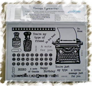
My next set of Creative Expressions stamps was waiting for me on the mat this morning so much of today has been spent mounting them and cutting them out. This month I have Sam Poole's vintage typewriter set to play with. A bit nostalgic for me as I did a secretarial course before going to college and for one of our classes we had to use typewriters like these. We did have electric typewriters as well but we had to learn on the old ones too. I guess this was just in case we ended up working for a company that wasn't so up to date.

For my first card using these stamps, I have kept things really simple. I love the way that the paper on the typewriter is sized so that the text stamps in the set will fit. I decided that I wanted to do a very simple card and thought that a thank you card would be the perfect thing....sometimes we all need a quick Thank you card and you can't get much quicker than this one.


I stamped the typewriter and sentiment in Ancient Page on smooth white card stock. Then I punched the spiral holes down the edge with an SU punch. I layered this on black card and then mounted this onto a square white card. I did play around with some black and white ribbon and paper clips, but decided that the card really didn't need anything else.

Sometimes less really is more.

I would like to enter my card into several challenges:

Alphabet Challenge "Quick and Simple"

Corrosive Challenge "Punches/and or Dies"

One Stitch at a Time "Punch it"

Sentimental Sundays "Monochromatic, must include a sentiment"

Stamptacular Sunday "Just Saying"

Wednesday, 14 September 2011

Silver and Blue


The next Tanda Teaser is to use Silver and any shade of Blue for your project.

For my card I stamped the heart panel (Tanda Romance set 2) in Versamark and then heat embossed with silver ep. I then painted over this with turquoise brusho ink. I used the same ink to colour some hand made paper (for the tag) and a short length of seam binding. (The seam binding takes the water based ink just as well as alcohol inks....it just takes a little longer to dry).

I cut the stamped panel out and mounted it onto hand made paper then I wrapped the seam binding around this and tied a bow at the front. This was then stuck onto a DL card. The sentiment was stamped using Tumbled Glass distress ink.

The tag was embossed using the divine embossing folder and the numbers were cut from mat silver card using Tim Holtz Vintage Market die. Having cut out the numbers I covered them in glossy accent before sticking them onto the tag.

I made this card for my next door neighbours....it was their 25th Wedding anniversary a couple of days ago. I would like to enter this card into the "Stampin' B's - Anniversary Challenge"

Sunday, 11 September 2011

Sunday Day Trippers....

This is my next Ethel and Murray creation using stamps from Creative Expressions' witty, Wrinkles don't Hurt plate.

I used chipped Sapphire Distress ink to stamp the image and to distress the edges of the circle and label. The dies were all Spell binders dies. The patterned background paper was actually made using a huge background stamp that I found recently...it is soooo big that it hangs over the edge of my largest acrylic block, but it still seems to stamp out large enough for a 5 x 5 inch card! Exactly what I need.

The colour, the check, the simple lines and the sentiment all give this a very humorous masculine feel.

With that in mind I would like to enter it into several challenges.......

"Fairy Fun Holidays - Masculine"

"Just Add Ink - White and one other colour"

"Stampman - Monochrome"

"Clearly Inspired - Patterned Paper"

"Corrosive Challenges - Funny or Punny


Monday, 5 September 2011

A Sketch


I haven't done a Lili of the Valley Challenge for a while so I thought I should make an effort this week. This week's challenge is a "Sketch". For my card I used Copic markers, Tim Holtz dies, Brusho inks, embossing folder, Martha Steward punches glossy accents and accent beads.
The flowers, handmade paper and the seam binding were all dyed using Brusho ink.
The sentiment was mounted in a die cut taken from a fruit juice carton that was coloured with alcohol inks and triple embossed.

P is for Pastels


Over on the "Alphabet Challenge Blog" P is for Pretty Pastels. This gives me the chance to enter my next Ethel and Murray card....Ethel has had another purple rinse. For my card I used Spellbinders oval die, Spellbinders tag die and various punches. The image of Ethel was coloured using Copic markers.